

by Leofrick R. (Karrtia Photography)
I am very sorry, this article looks absolutely awful on mobile, it is best viewed through desktop view
A Photographer’s Breakdown of FNAF Ruin
Ruin, the free DLC expansion for FNAF Security Breach, released on the 25th of July 2023- only 4 weeks ago as of writing this.
Cosplays are going to be built, are probably already being built, and I have been preparing for the inevitable con season wave with bated breath. So much so, that I decided to put together a collection of longform notes and resources catered towards replicating the game’s visual style. This compilation specifically caters to cosplay photographers who aim to recreate the game's distinct look- however, these resources may prove equally beneficial for other visual artists seeking inspiration from the game's aesthetics.
I have personally put together references and resources for the game within this article, and am actively searching for more assets and additions to make freely available. On top of this, I have put together a paid Lightroom preset pack mimicking the colour grading and visual style across various levels within Ruin, which is already live on my site.
I am an independent in no way associated with Steel Wool, and while I would love to collaborate with others who enjoy open resource gathering and accessible video game archival, this particular article was put together by myself in hopes of encouraging fellow visual artists.
Through this, I will be predominantly discussing the game’s overworld (the ‘Real world’) with some mention of the alternate map for each level (the ‘AR world’). This article will contain open spoilers in both text and image, and external links to helpful resources.
Colour & Lighting
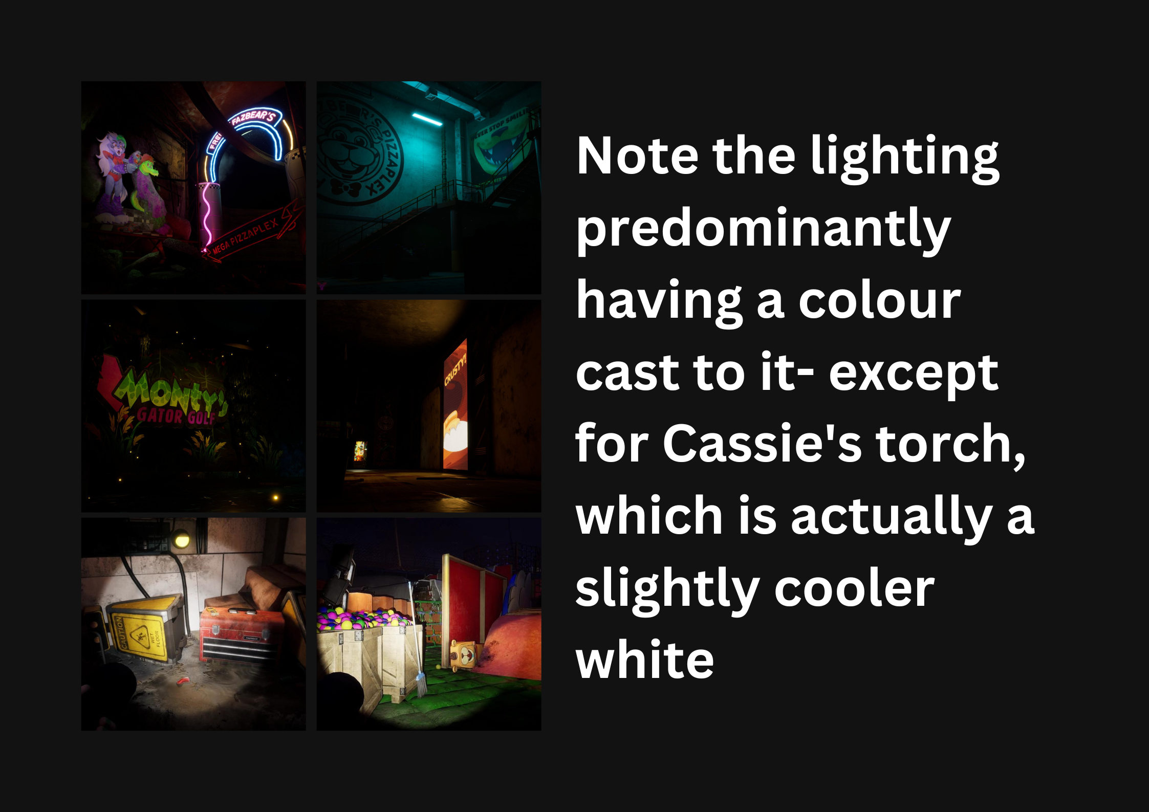
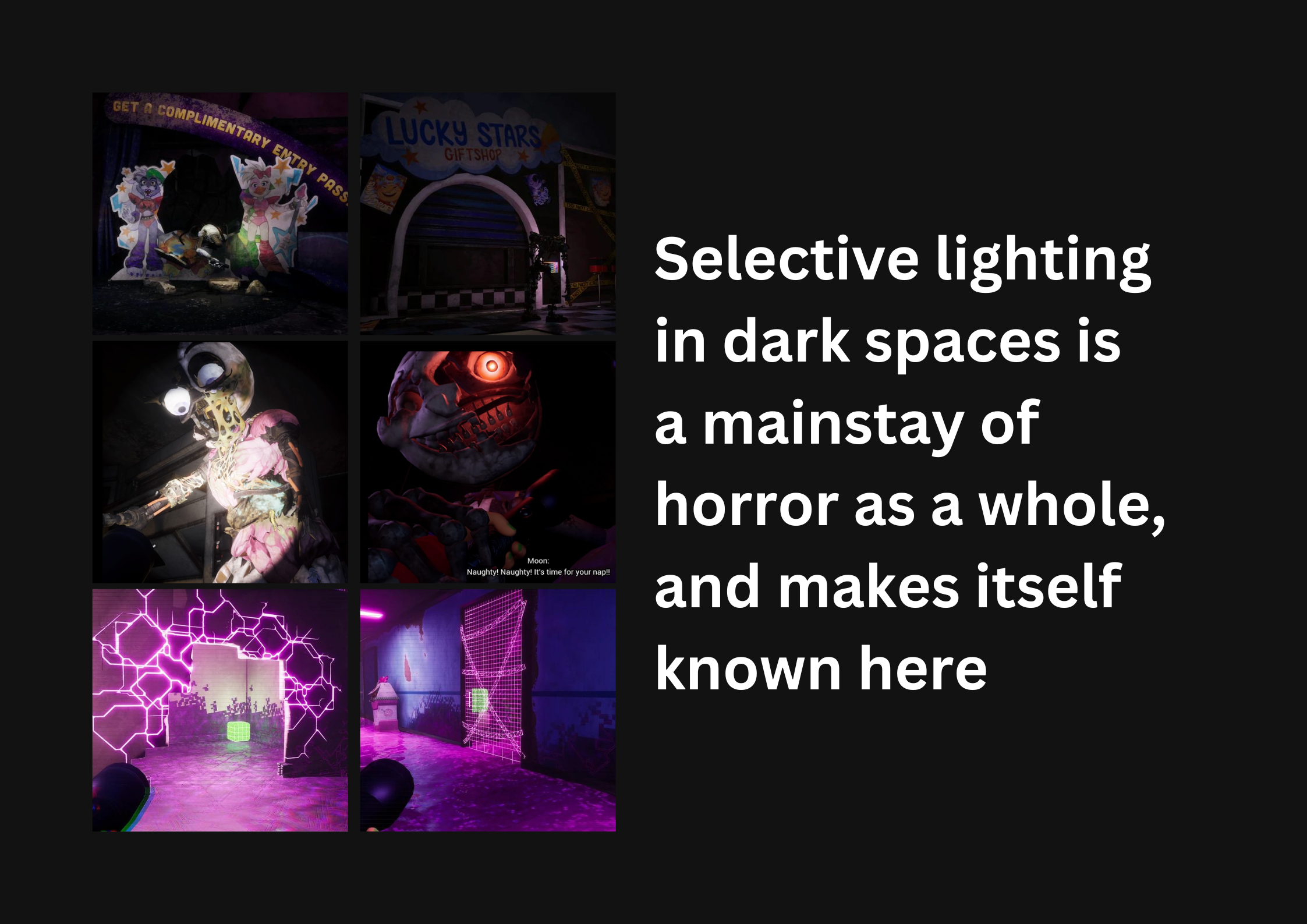
The usage of colour and lighting within Ruin directs the player towards where the developers want their eyes to be, setting up the intended framing and directing a clear path through the Pizzaplex.
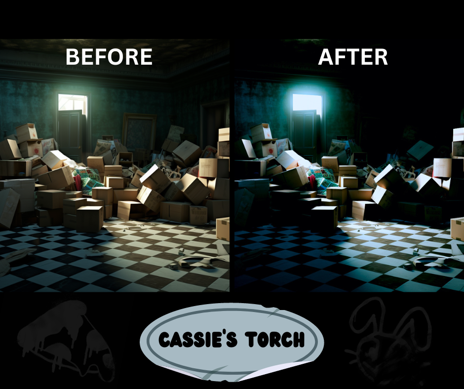
The dark environments with selective lighting give dimension to the focal points, singular or predominant sources of light being used to help story elements stand out from the cluttered and disorganized chaos of the background. Your path is lit with neons, collectables are in complimentary coloured boxes to contrast with the environment, and spotlights shape the edges of setpieces. Keeping the predominant environment darkened allows the developers to curate carefully where attention should be drawn first, resulting in a high-contrast environment usually with a singular light source; these lights are never a clean white, save for the one player-controlled torch.
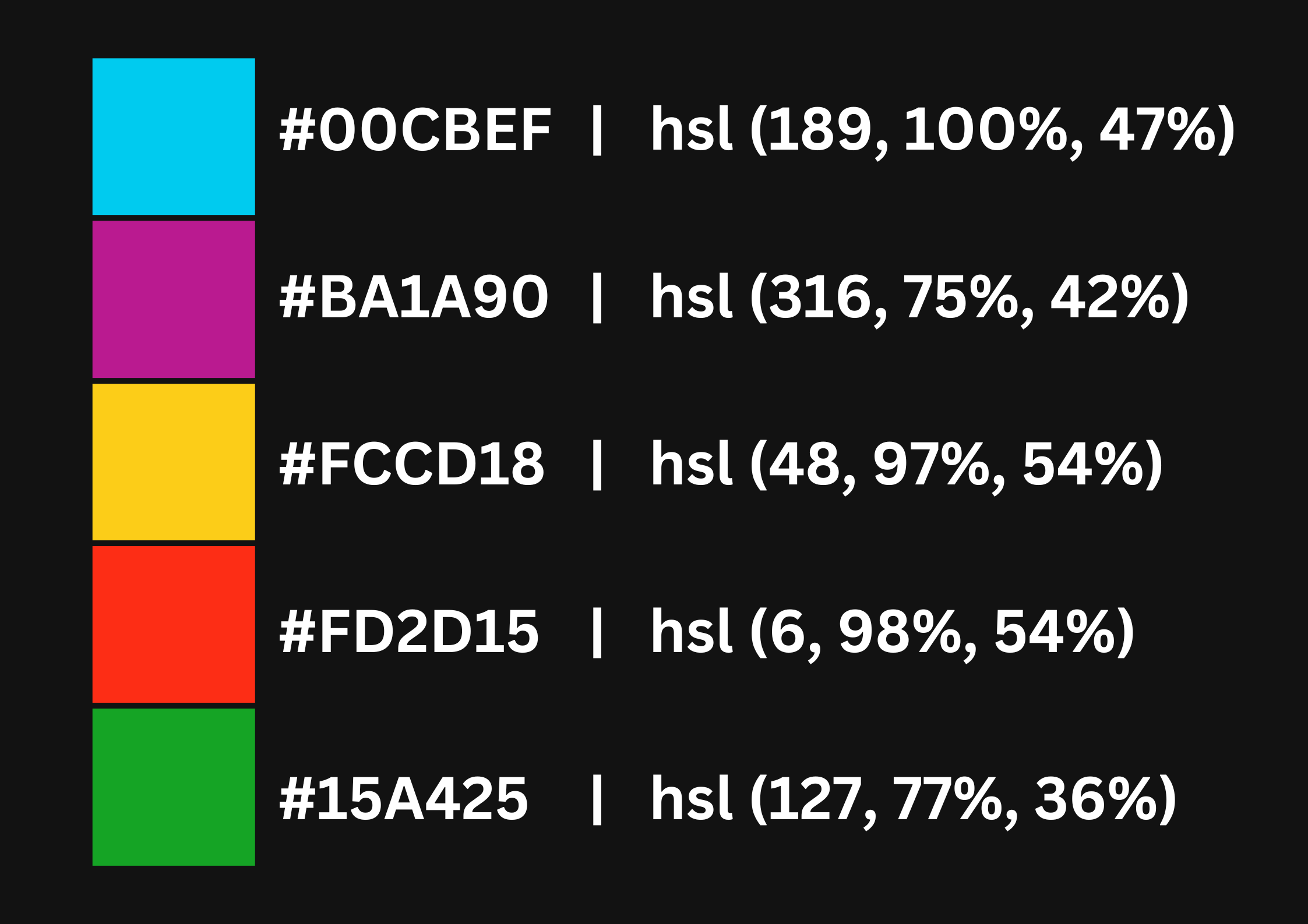
Notable Colours
Within the environments of Ruin, Fazbear Entertainment seems particularly fond of using a very specific set of colours as their predominant contrast against the darker environment. Across the Pizzaplex, certain colours make their appearance again and again throughout design elements and environmental lighting, as motifs across important tools or visual indicators of game direction.
I’ve affectionately named each of these colours while putting together this article- Freddy’s Electric Blue, MopBot Yellow, Danganronpa Pink, Keytar Green, and Vanny Red.
To the side I’ve listed the Hex codes of the best examples I could find of each colour, most colourpicked directly from Security Breach assets (Which tend to be somewhat cleaner), and also a conversion to HSI for use with RGB LED lights during photoshoots.
Colour Grading
Each unique section of Ruin as a game has notably different colour grading and environmental lighting, moreso than the consistency of other games I’m personally familiar with. I’m not entirely sure how this was achieved within the game itself, but I took the time to convert as many different environments as I could find into Lightroom presets available through my store. At the end of this article, I’ll talk more about the preset pack.
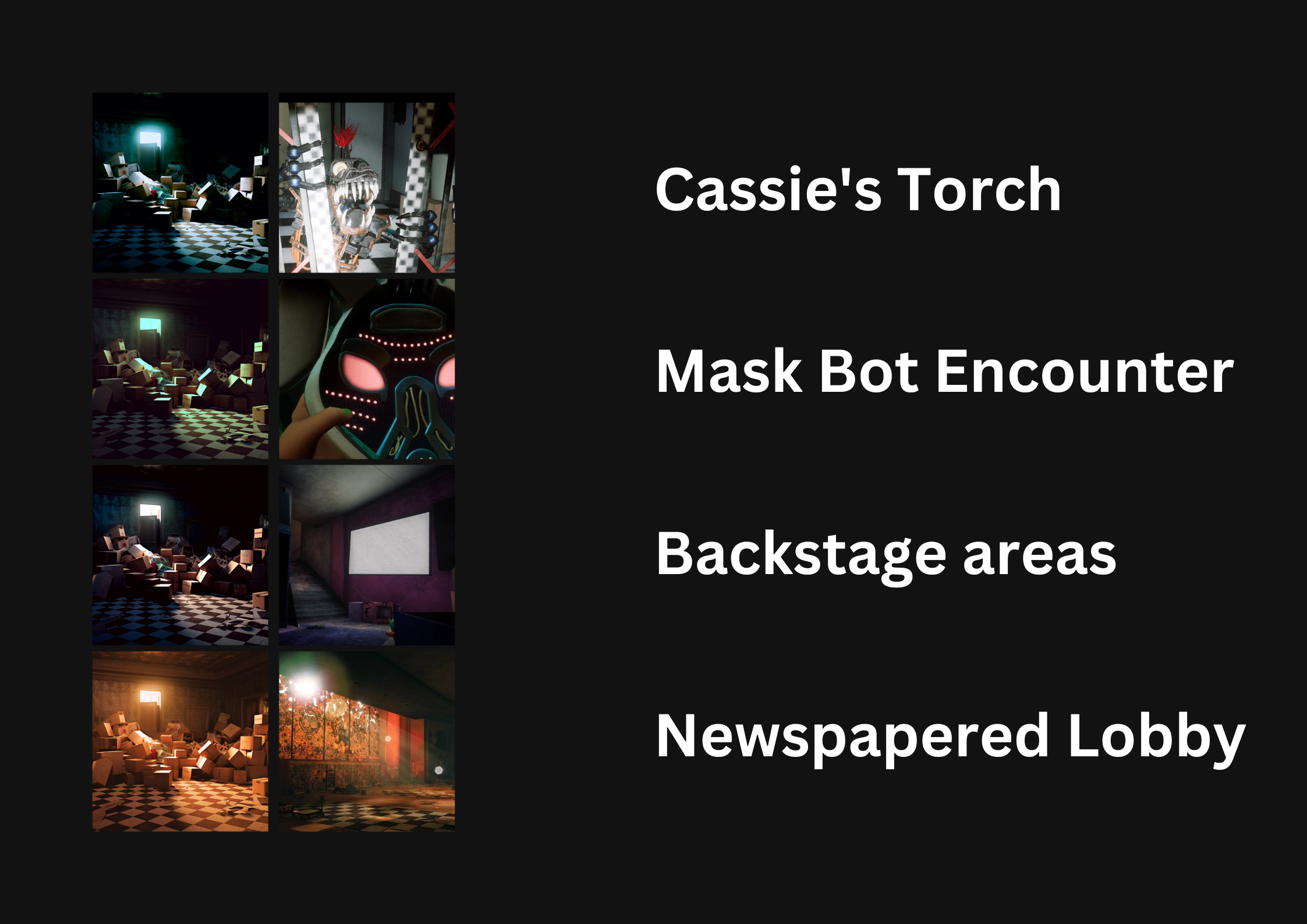
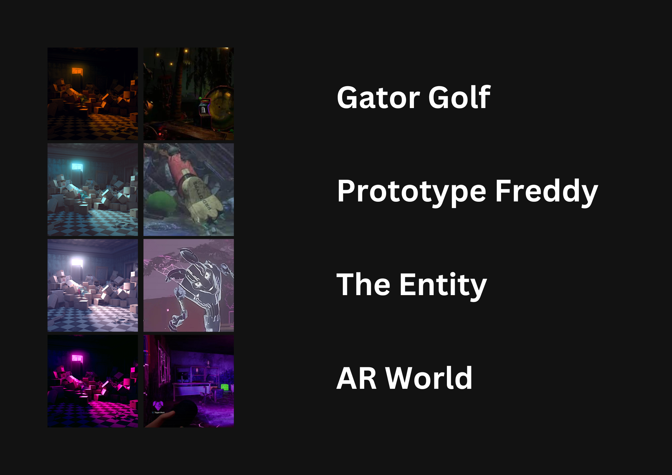
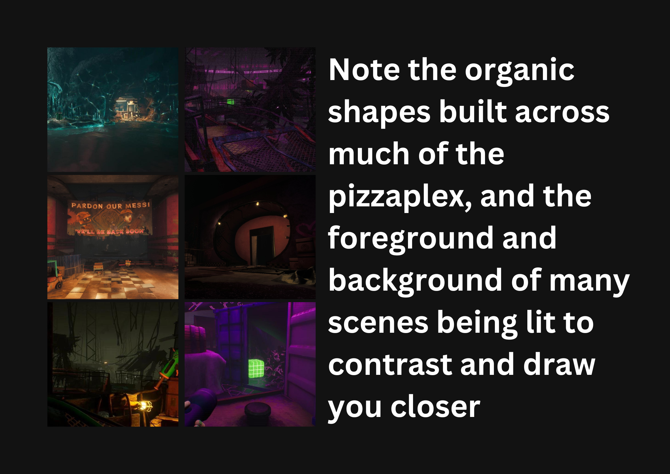
While some of the overworld (‘Real’) locations have high contrast and deep shadows, this is not a hard rule. I found that much of the shadow colour grading had tones of a warm blue (Backstage areas, Lucky Stars café, Mask Bot encounter), a muddy green (Gater Golf) or occasionally a crisp teal (Freddy encounter, some Monty encounters), with the highlights leaning towards golds and pinks (Newspapered Lobby, Lucky Stars café, Gator Golf) or occasionally a desaturated cold blue or mint green (Mask Bot encounter, some Monty encounters, Freddy encounter, backstage areas).
Put simply, the high variety and inconsistency of colour grading through the levels makes it difficult to pin down a single colour profile for the game as a whole, however at no point in the game is the lighting a clean white- straying either notably cold or warm, with visible ambient coloured lighting filling in the mid or dark spaces.
The AR world, however, has mostly consistently blue undertones, with a warm magenta cast to most of the lighting. As the Entity approaches, this is reduced to a much greener colour cast across all values, with reds and blues replacing the warm purples.
Lighting
Much of the Pizzaplex is dark, lit selectively with neon lights, flickering bulbs, and glowing detailing. Even your player character is turned into a light source with which the developers selectively light cutscenes and encounters such as the jumpscares. Horror within the game is often derived from the unknown, and so great portions of the game take place in environments dark enough to keep enemies obscured without the help of your torch. Lighting is not used within the game to illuminate a subject, but rather to trace its edges and suggest that it is there- or give you a singular glowing eyeball to fear from the shadows.
Within free roam video games of most natures, it’s much harder to enforce a strict composition in the way your player interacts with the environment around them. However, there are some ways developers can still frame a three-dimensional space that can draw your eye and inform your path. Ruin seems to enjoy leading players using complimentary colours and circular composition, creating frames-within-frames around pathways and points of interest. Swooping piles of scrap pushed up against each wall with a space carved through the middle, or rounded rocks protruding through the ceiling to soften hard edges- I have an inkling that if I took a Golden Ratio overlay to many of the first views we are given of each game environment, the swooping curves and layers of contrasting colours would match rather notably.
(I am unable to find a clean copy of the game textures as of yet, but when I do, I will make such resources known and available- I am hoping to find, if possible, in-game assets such as the graffiti used for the walls. I know the paint spills are projected atop other textures due to a glitch where they will momentarily clip onto Monty, and I hope the graffiti and dirt textures are added in the same way so they can be extracted for use in cosplay photography edits and the like. If anybody has information on where to access extracted game assets for Ruin, I would be very appreciative for such resources.)
Wear and Tear
Props and Motifs
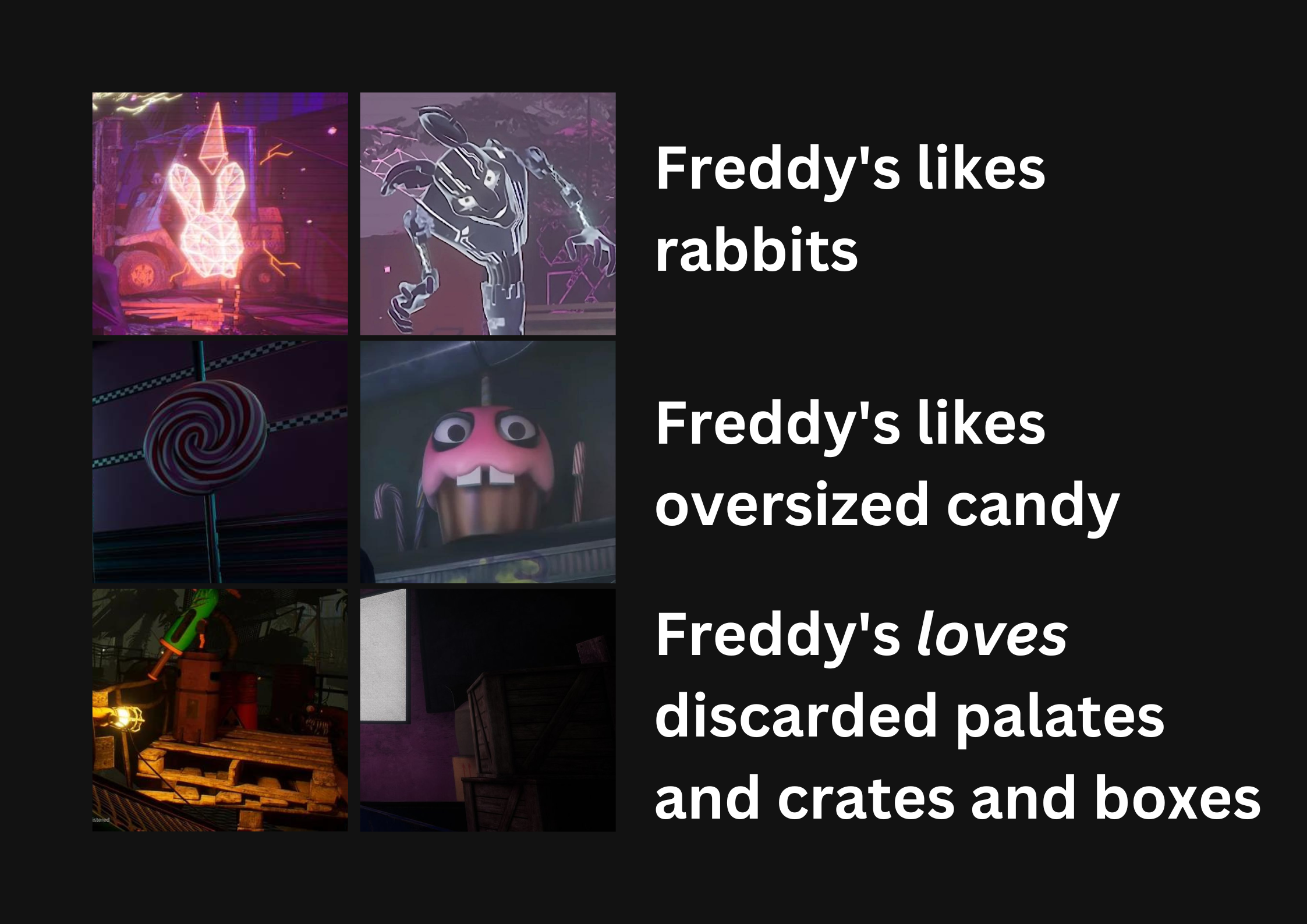
There is some symbology that is frequent across the Five Nights At Freddy’s franchise, especially relating to certain characters within the storyline, and figurative icons used to represent such. Circus Baby is linked closely to ice-cream, Chica is often represented with candy or pizza, and Foxy is represented by pirate motifs, or his (their?) hook.
In Ruin itself, we deal with only five significant animatronics (Including Mimic), although there are copious references to others. Bonnie, Vanny and Spring/Glitch/Burntrap are all tied to the rabbit motifs reoccurring throughout the pizzaplex, with subtle differences to each signifying who may be who. The Marionette/The Puppet is also referenced occasionally in the deeper levels, as is Circus and Scrap Baby rather heavily. FNAF leans heavily on their signifiers and motifs to tell story, even innocuous props such as the repetition of ice cream accompanying significant moments, and the choice between crates and barrels in a room.
The more innocent reoccurring props come in the form of trash heaped around the Pizzaplex, in bags torn open by Chica in her hunt for a meal, in boxes flattened and covering spillages of unknown acidic substances. Fallen metal scrap litters the scenes, and plant or rock facades detail the amusement areas.
Pizzaria Design
Many of the original Security Breach designs are still present within Ruin, as the game clearly takes place within the same environment after an unknown amount of time. Security Breach itself draws heavily from the aesthetic influences of glam rock, taking cues from the movement’s bold colours and extravagancy with vibrant palettes, clean vector-style patterns, and exaggerated shapes.
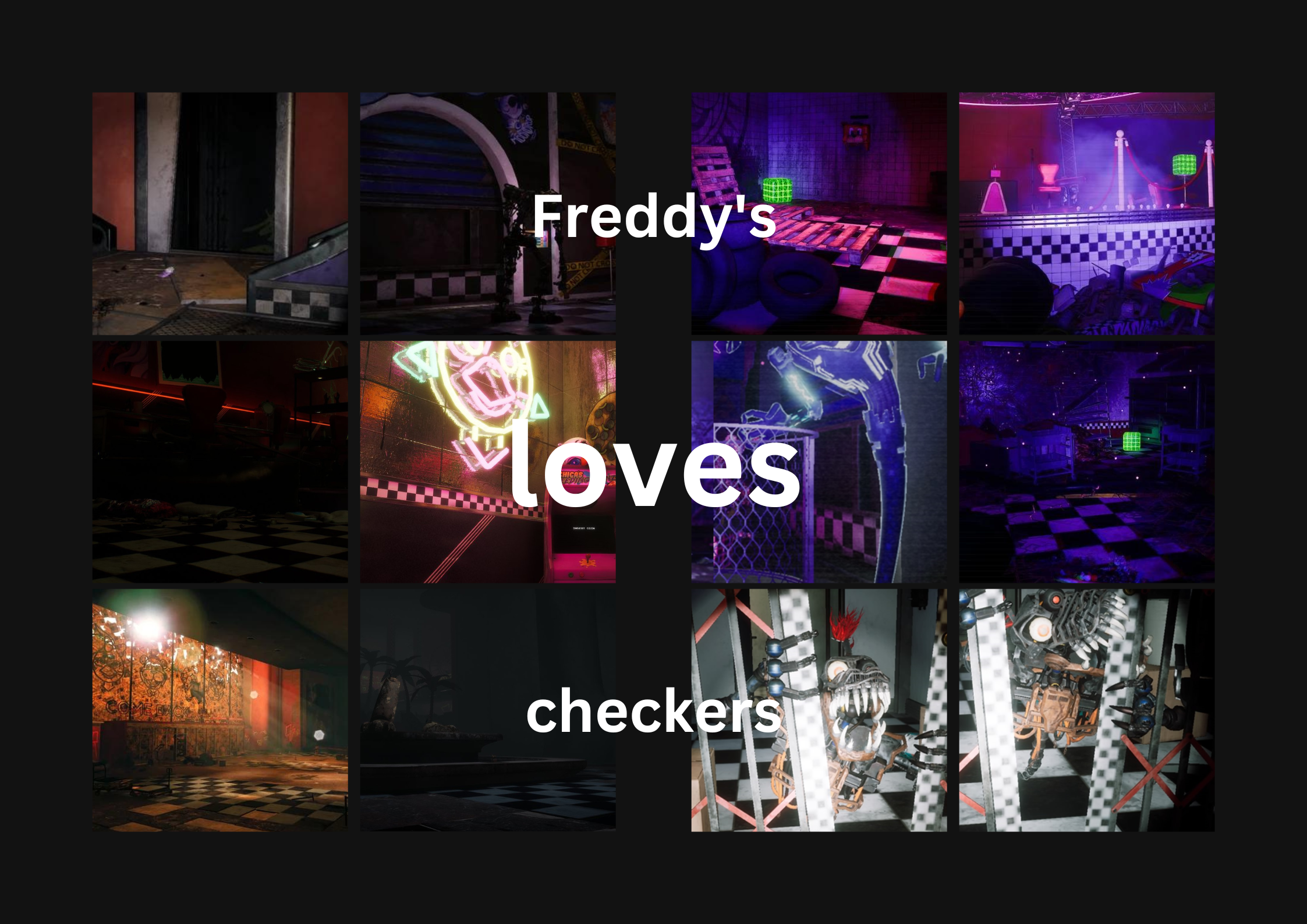
The checkerboard pattern scattered throughout the Pizzaplex with a heavy hand is an iconic visual element of the franchise as a whole, recalling the very first game with its simple but memorable design.
Final Notes
EDIT: I found one. I freakin’ found one. This took so long, it’s not everything, but it looks like it’s regularly updating still. Will update in time.
Click here for Ruin game assets: !!!!!
Composition & Framing
Environmental Detailing
Particulates
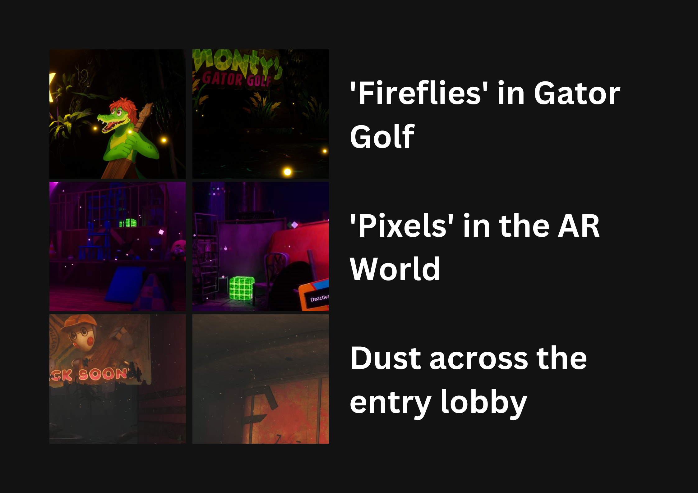
The ambient environmental effects throughout the Pizzaplex add greatly to the atmosphere, helping bring realism to some parts and possibly hiding programming issues with others.
In the Overworld, some rooms contain floating dust particles that gleam in the light, most notably within the first chapter. Monty’s Gator Golf zone has what are assumably fireflies, floating warm orbs of light referencing the environment the character hails from. In many parts of the game, Mist constrains your vision (Likely in an effort to reduce render distance strain) and provide a clean backdrop to an otherwise cluttered environment. Within the Overworld also, the developers seem very fond of having light-diffusing mist behind focal points backlighting them and giving them dimension. Notably for the amount of environmental mist in the game, there are only 2 examples of a god ray effect I could find – other lights however having a noticeable blooming effect, very few lights in the game sharp. This can be seen also in model renders, much of the game has heavy blooming.
In the AR world’s map, the ambient particulates instead take the form of drifting squares, with a VCR-reminiscent overlay that has regular static and chromatic aberration. The Entity’s proximity directly affects the static on the screen, as well as the contrast levels of your view (Getting lower contrast the closer the Entity is). With the Entity’s jumpscare, an increasingly strong green/magenta chromatic aberration is seen along with a heavy glitch effect. Despite much of the AR world’s assets presumably glowing, I cannot find evidence that anything but the Parent Nodes and AR Collectable Boxes actually emit light. I would love to be proven wrong here.
In the environment of the Ruin DLC, an unknown amount of time has passed since the events of the original Security Breach, enough to cause significant damage and disrepair to the abandoned Pizzaplex. Throughout the game, you encounter spills and leakages, debris and dirt piling up and weathering props that were otherwise clean in the main game. Metal is torn apart, and graffiti coats the walls.
Other wear and tear detailing through the game includes malfunctioning neons, torn fabrics, exposed cables and wiring, broken or crumbling statues, plants springing up between broken tiles and flooring, crumbling and unsafe staircases and ramps, and worn paint exposing the construction below.
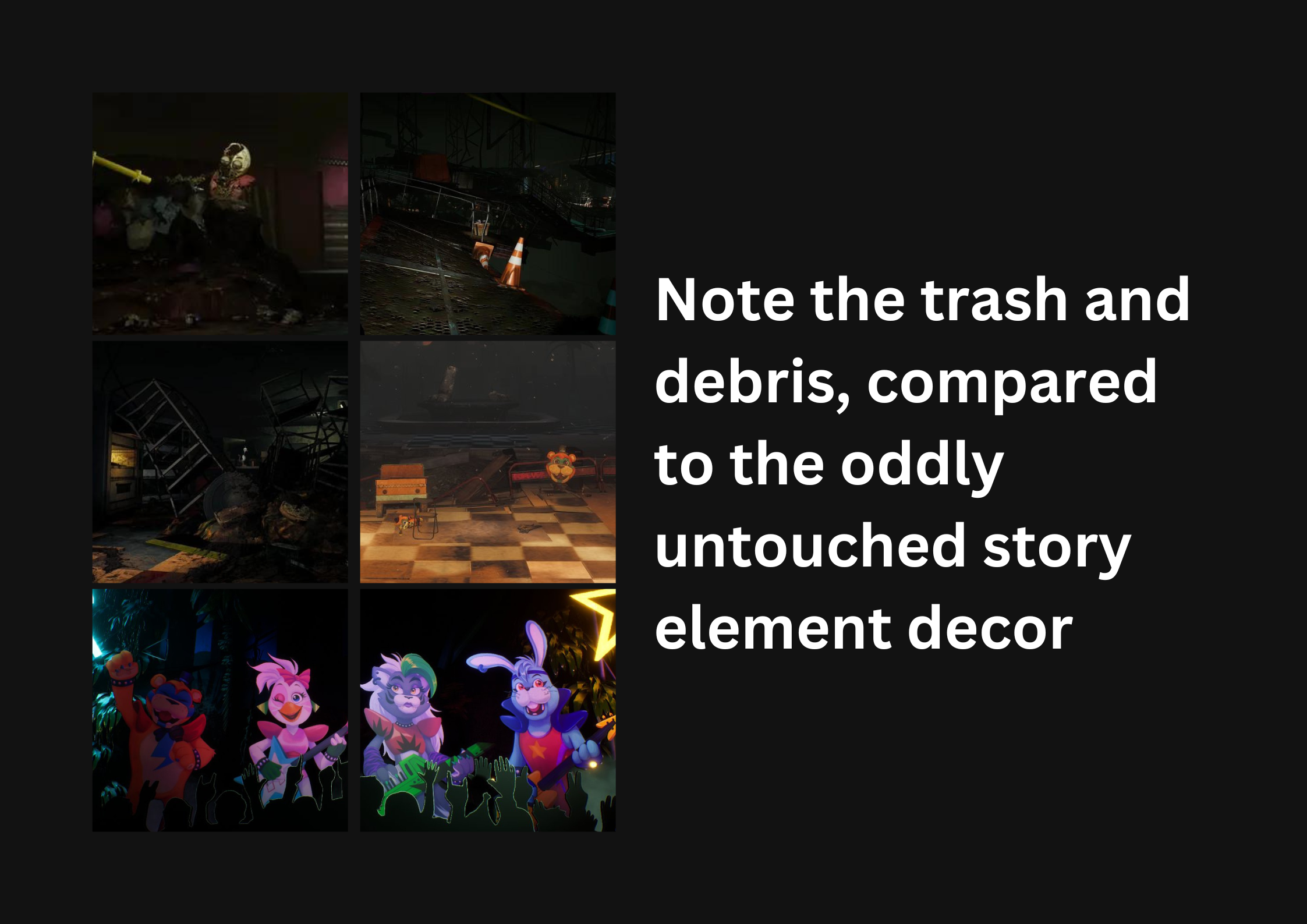
The amount of weathering across the game overworld is highly inconsistent and does not quite track with the implied timeline, suggesting a much longer time has passed than is possible by the game’s story. However, other parts of the game are near-untouched, usually important story moments that need to draw attention.
The visual style within Ruin can be effectively imitated through a photographic or artistic lens, if sufficient attention is given to the colours, lighting and composition of the scenes within the game, and notable motifs throughout it. Ruin leans heavily on singular-coloured light sources and curved composition to frame its scenery, displaying bright pops of colour within dark and muddy environments to lead the eye.
In terms of post-processing, Ruin has a significant amount of lighting bloom and dust particulates throughout the game, as well as notable instances of VCR-style overlays and green/magenta chromatic aberration.
I have put together a paid preset pack to accompany this little project, with 9 presets designed to mimic the different lighting effects within the game. These are not essential to reproducing the look of the game in your own work, but I hope they are seen as an appreciated additional resource and a way to support my work.